Breakdowns
4/19/21
4 min read
Revisiting the NFL Draft Trade Chart Using Approximate Value
By Sydney Robinson
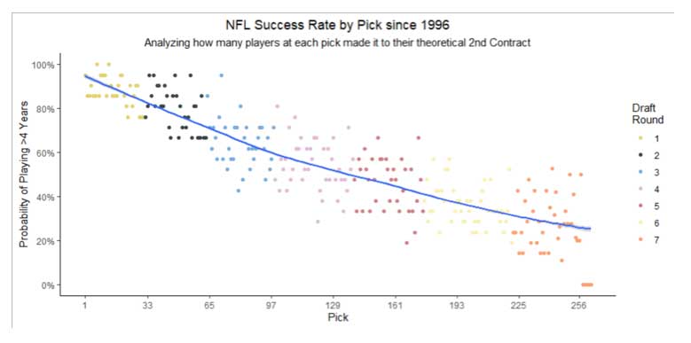
Projecting NFL success from the time a player is drafted is never easy. Before we get into any discussion about value, how much a second contract will cost, or any other incredibly early career expectations, it is important to just understand which drafted players still expect to be in the NFL for five years (or the start of their second contract).
There has been a significant amount of evidence that shows players drafted in the first round maintain their value across the length of their career (and earnings) relative to a player with the same production but who is drafted in later rounds. For argument sake, we could say this curve is reflective of a team’s belief in a player and their respective long-term upside or willingness to offer a second contract.
In terms of what a draft pick’s value should be, Jimmy Johnson has a well known, longstanding NFL Draft Pick Valuation Chart, which is based on a points system that values the first pick at 3,000 points and the last at 2 points.
This has widely been accepted across the NFL for years. Trades for future picks, just like all the movement we have already seen in this draft, could be using a chart like this as the backbone to their decision making. After all, a pick three years from now will still realize meaningful value for a team.
How do we know this valuation is correct, though? While there are not tons of great all-in-one metrics in the NFL, Approximate Value is one of the more widely accepted ones. It certainly has its flaws (such as Pro Bowls and that game’s flawed voting system being influential in the calculation), but it is better than anything I have created to date. Therefore, no room for me to do anything other than acknowledge some of the limitations on this study.
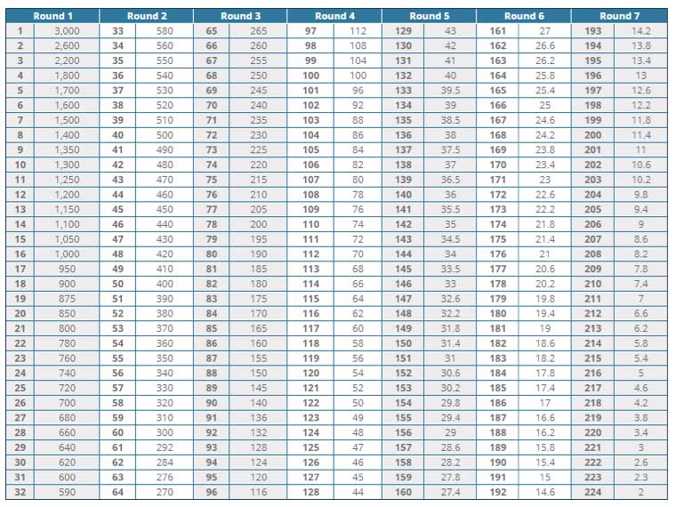
Utilizing Pro Football Reference’s Approximate Value, we attempt to calculate our own draft curve based on the Career Approximate Value a player had. This serves as the value of each pick.
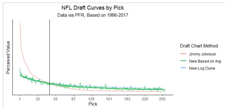
The chart above compares our draft curve to Jimmy Johnson’s trade chart. Johnson’s curve is in red, placing massive importance on the very top of the draft with value diminishing quickly. We formed a curve with two parts.
The blue New Log Curve helps properly value the first and most of the second round. The green New Based on Average curve follows a bit better path for the rest of the draft. If we were to stay with one curve or the other, then early picks would be undervalued and late picks would be overvalued. This is similar, but slightly different than previous work.
It is important to acknowledge that as the draft goes on, the volatility increases. This can be shown on a limited basis with the spikes even in the later rounds on the chart. Taking a cautious approach, that is why we went with the green colored curve that is a bit lower than the blue Log based curve.
Overall, we see that Johnson’s chart massively overvalues early picks compared to our curve. However, there is an inflection point around the mid-50s where Johnson actually begins undervaluing players and the opportunity cost flips. If you are dealing with a competitor that uses Johnson’s valuation, surplus value can be acquired by making trades in this area.
Putting this in practice, let’s look at a potential trade between the Giants and Bears. Based on Johnson's draft chart, the Bears can move up nine spots in the first round. They would receive the Giants' 11th overall pick in exchange for the Bears’ 2021 20th overall pick, a 2021 third-rounder and a 2022 first-rounder. If we look at this at its face, the Giants would receive over 30% more value for this trade than the Bears.
The last major note is that this does change from year to year and those considerations are important (but outside the scope of this article). For example, one could value Trevor Lawrence this year more than Joe Burrow. Different tiers in the draft are stronger than others as well.